News Room
- Home
- News Room
- Reading lists
- The Duality of Two-Step...
By Jamie Quatro
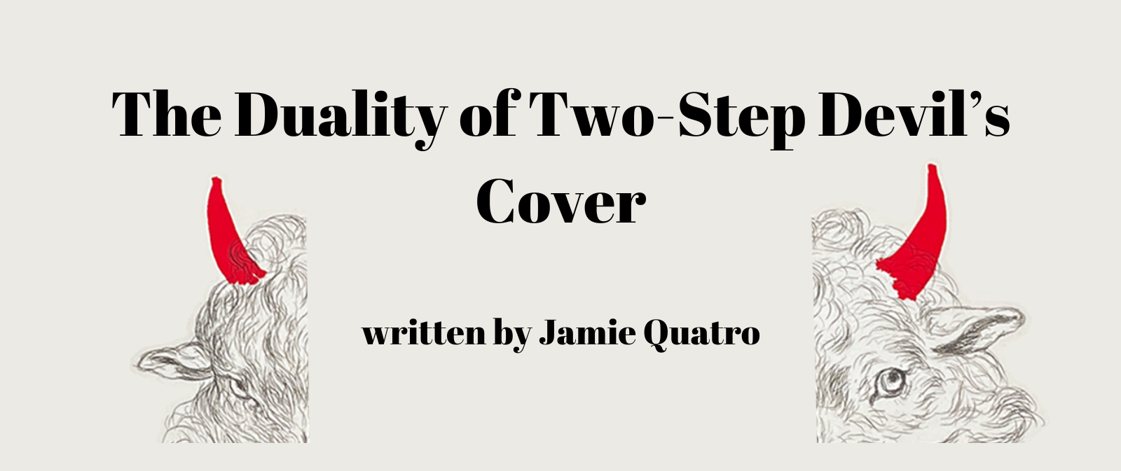
When I first saw Alex Merto’s design for Two-Step Devil—a cheeky goat’s face drawn in pencil, with paint-splash devil horns—I couldn’t tell if my instant gut-butterflies were a product of excitement or anxiety. I live in the South. The devil is suspect down here. Yesterday, at brunch with my family, I asked the server how many deviled eggs came out with the order.
“Seven,” she said. “Weird, right? You’d think there’d be six.”
The devil being on my mind of late, I made a joke. “Six is the devil’s number,” I said. “Seven reclaims the eggs for God.”
“Oh, you would not believe how many people refuse to order ‘deviled’ eggs,” the server said. “At least once a day someone asks for ‘angeled’ eggs.”
She was quiet for a moment. “You know, that probably is why there’s seven,” she said.

It seems every writer I know has a cover battle story—at least, those of us lucky enough to have a say in jacket design. Months of back and forth, agents and writers asking to see comps, art directors and editors up against a ticking publication clock. Why is it so difficult to get it right the first time?
I posed this question to a few writer friends. “Years of work, imagination, and sacrifice are being threaded through someone else’s needle,” Sloane Crosley said. (Merto also designed the cover for Sloane’s memoir Grief Is For People.) “It’s exciting but it’s also a recipe for defensiveness from all parties. Sometimes the author gets too attached to an image, forgetting this is a book jacket and not a private joke. Or forgetting that people who buy the book do not give a damn if the image is a reference to page 219.”

“On the other hand,” she said, “sometimes the publisher kowtows to the concept of a market, to their own best guess. This is a general way of doing things that does not apply to any other arena of anyone’s life. Imagine going into a restaurant, pushing the menu aside, and saying ‘I hear hot foods are popular, bring me all your hot foods.’”
“You have an entire universe in your head,” novelist Samantha Harvey wrote. “And then someone compresses that universe into a single image. The question isn’t ‘why are covers so difficult’ but ‘how is it possible that a cover ever gets it right?’”
So what does make a good jacket design? “For me,” Sloane said, “the litmus test is simple: Would I want this image framed and hanging in my apartment?”
Yes. I want my cover to be Art. I want it to grab and hold my gaze simply because it’s beautiful. I also want it to give some hint, however glancingly, of what’s between the pages. And then I want it to blow wide open with meaning. With possible meanings. A good cover is the proverbial stone dropped into a pond: the initial splash, the shimmer. The concentric circles echoing outward.

How does Merto’s cover get it right? Some context:
Two-Step Devil is about an old man known as the Prophet, an outsider artist who paints his end-times visions on scrap materials he salvages from the local junkyard. He believes the visions are messages from God meant to warn the President about the coming decline and fall of the United States, and eventually the fall of the entire planet. The novel is set in 2014, two years into Obama’s second term. The Prophet thought he’d get to the White House himself. Now he’s dying of lung cancer and knows he won’t make it. He’s afraid that when he dies, his paintings and their prophetic meanings will be lost.
One day the Prophet sees a Mercedes pull up to the abandoned gas station across from the junkyard. A man in a vest and tube socks gets out. In the back seat is a young girl with zip ties on her wrists. The Prophet realizes she is being trafficked—and that he is meant to rescue her. He believes she is an angel sent from God to ensure that his visions get to the White House.
The “real-life vision” shakes him to his core. He goes back to his cabin and, in an effort to calm his stuttering nerves, works on his latest drawing: a sheep with its mouth held wide open by God’s “mighty right hand.” God’s other hand—the left—is stuffing a lamb inside the sheep’s mouth. He’d thought the vision meant the world needed to feast on the Lamb, Jesus Christ. Now he realizes the lamb is, in fact, an image of the girl:
Yes, the lamb was the girl, the sheep the men who bought her—and the hand shoving her in was the man in the vest and tube socks!
When I re-read the above passage during the proofread stage, I had a moment of realization similar to the Prophet’s. Merto’s cover image wasn’t a goat—it was a lamb. It was only the horns that suggested “goat.”
Devil horns superimposed onto a lamb. Evil imposing itself onto goodness. Of course.
But the more I looked, the more I felt something was. . . off with this lamb’s face. Something with the eyes. One of them was narrower than the other. And the fur wasn’t uniform. Fluffy and light on one side, dark and hairy on the other.
I covered the hairy, narrow-eyed half of the face with my hand, and behold, here was a wide-eyed lamb. I covered the lamb, and: behold, sinister goat.
So it wasn’t a goat and it wasn’t a lamb. It was both. One face, two oppositional forces. Love, purity, and innocence on the lamb side; cunning, mischief, and evil on the other. In one beautifully drawn image, Merto had evoked my three major characters: the Prophet and his sheep drawing, the innocent girl, Two-Step Devil and the traffickers.
But there was something else.
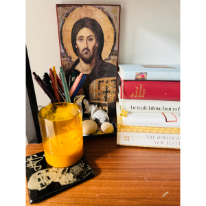
My Christ Pantocrator icon. It sits on a shelf beside the chair where each morning I light a candle, read the Daily Office, meditate, and pray. My icon is a replica of the original encaustic-on-panel in Saint Catherine’s monastery at the foot of Mount Sinai. It’s one of the earliest known Pantocrator icons in the Orthodox tradition, dating from the mid-sixth century. The image depicts Christ looking out at the viewer. His face is split down the middle: one half is bathed in light, the eyebrow relaxed, the gaze loving and accepting; the other half is chiseled in shadow, the brow peaked in a frown, the gaze powerful, wrathful.
Cover one side, you see Jesus in human form, meek and mild; cover the other, you see Christ the Divine Conqueror. Lamb, lion. Love, judgment. Mercy, condemnation.
I’d assumed that Merto hired an artist to draw the sheep. But last week I learned that it’s a 1793 study in pencil by a Dutch artist named Martin Ferdinand Quadal: Viff Schaapskoppen, or Five Sheep Heads, with my two-faced sheep at the center of the study. I’ve never met Alex Merto, nor corresponded with him. And yet he gave Two-Step Devil a cover that passes Sloane’s would-I-hang-it-in-my-house litmus test, suggests all three major characters, conveys the coexistence of good and evil, and references the only icon I have ever owned.
That’s good design. Probably some coincidence. Or maybe it’s something so mysterious I shouldn’t look at it directly.


